The complete site health solution for WordPress
A comprehensive methodology for healthy and thriving WordPress websites, transforming them from liabilities to valuable assets.
Trusted by


Grow fearlessly. We’ve got your WordPress.
SiteCare’s expert security and performance optimization keep your website safe and fast, freeing you to focus on what matters – scaling your business.

Proactive & Vigilant
Block malware threats and patch vulnerabilities faster with our real-time scanning and automatic patching. Rest easy knowing your site is protected from hackers and online attacks.

Fast & Reliable
Experience improved load times and enjoy 100% uptime guaranteed. Your website will be lightning-fast, reliable, and deliver a seamless visitor experience.

WordPress Pros
Save hours per month on website management. We handle your ongoing technical tasks, including 24/7 monitoring, theme updates, site restorations, and plugin conflict resolution.

Constantly Optimizing
We’re always optimizing our hosting environment and our SiteCare Score to keep your site running smoothly. We’ll handle tricky plugin updates, improve your Core Web Vitals, and resolve technical SEO issues for perfect site performance.

Quick Support
Our friendly Account Management Team is available by email and phone to help resolve any unexpected issues promptly. Nearly 50% of client emails are not only answered but resolved in under an hour.

Succeed on Google
Rank higher and attract more traffic with technical SEO improvements and our Google Core Web Vitals guarantee. Retain 24% of visitors leaving your website due to slow speeds and frustration.
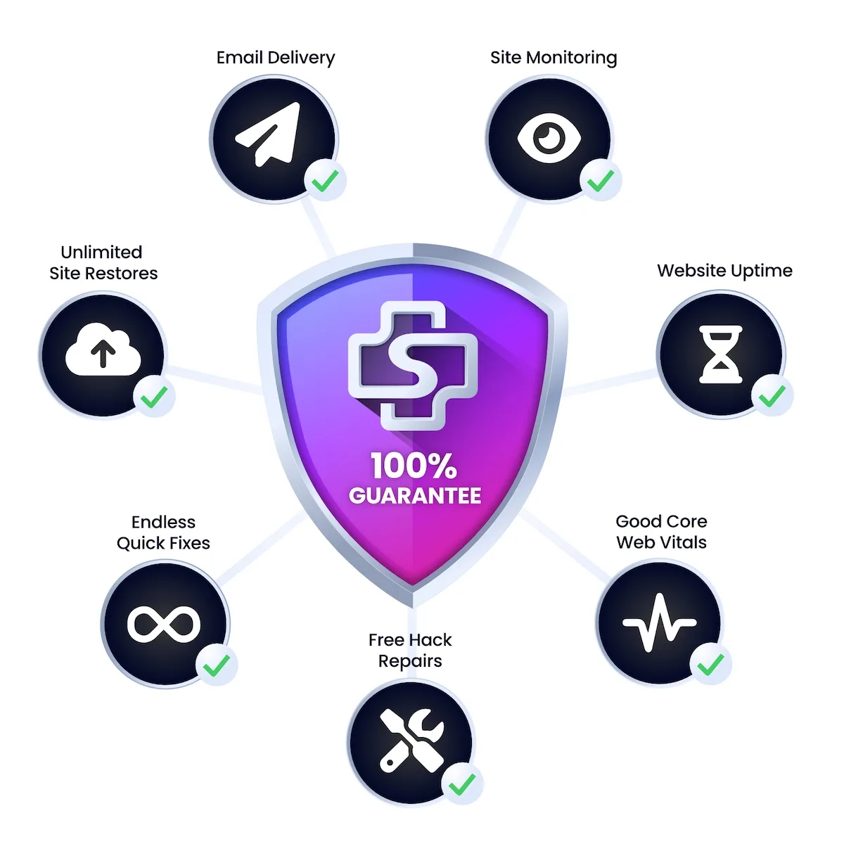
100% Guaranteed.
Nobody else comes close.
We’re so confident in our ability to deliver industry-leading uptime, reliable email delivery, robust security, and responsive support that we offer a service credit equal to one month’s SiteCare service if your website experiences downtime, emails go underdelivered, or your Core Web Vitals are less than good.
-
Since I began working with SiteCare in a moment of crisis, where the foundation of my business was in jeopardy, I was first looking for an immediate cure—and then ongoing visibility. I got both, in spades.

Nicole Hunn
Gluten Free on a Shoestring
Testimonials
Our clients love us
Honest and authentic feedback from the clients who we’re privileged to work with every single day. Hear first-hand what it’s like to work with SiteCare.
Pricing to scale with you
Flexible plans to fit your evolving needs.
Check Your SiteCare Score
Take our free 4-minute quiz and we’ll deliver your SiteCare score along with a set of recommendations to help improve any website problem areas.